10 / 03 / 16
To introduce the concept of the collective alongside social medias I decided I would produce a complimentary 001 intro edition CD which I would present in a little leaflet/publication which would also hold a little intro card displaying the starter concept of the collective and advertising where to find us on social media. Using the stock I still posses from the personal identity I will produce it consistently to the rest of the visual identity.
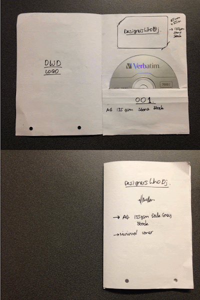
I had previously found a very inspiring way to present personal branding and stationary on a design blog which made use of a slot for a CD and intro card. Taking inspiration from this I experimented with a simple paper concept of how mine could work..
It displays stock choices with reference to colour schemes, a brief plan of layout and then various dimensions. For example how it will need a 122mm slit to fit the CD, and the spacing required to fit an 85x55mm card in aswell.
With all these features of the design clearly stated infront of me I was quickly able to produce a digital concept to display colour schemes and aesthetic detailing of how it was to look. The only addition would be for the colour of the CD sticker - which I plan to be backgrounded with dark grey.
Through feedback sessions I was assured that I had represented the balance of colour well and it does effectively remain consistent with my other personal branding for the module, sitting very minimal. I feel this offers a very professional and well balanced layout design for the collective. I also included my logo on the back of the publication for further recognisability.
However, it was also brought to my attention in a later session that it is not clear at all what is actually on the CD, therefore I have decided I will have to add a bit more context beneath the '001'.
However, it was also brought to my attention in a later session that it is not clear at all what is actually on the CD, therefore I have decided I will have to add a bit more context beneath the '001'.
The three InDesign documents were simple enough to prepare. It was this stage that made me realise I do not need background colours in the documents set up for prints, as it is the coloured stock which provides it. This involved me going back through and preparing each printable file based on the coloured stock it was being printed on.


No comments:
Post a Comment