I wanted this to then be as striking and representative of me and my practise as possible.
I began by considering people/brands I look up to and think has a strong identity which reinforces them as a designer/creative.
The simple symbol or icon is reflective of their stripped back and simplistic design style - yet it is powerful enough to work alone and still be recognisable.
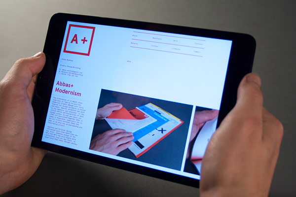
Abbas Mushtaq or A+


Instead of using initials, Abbas took his first initial and added a + sign after it, which commonly is a mark for excellent. While branding himself as excellent being a clear marker in itself, the + sign has many connotations including...
+Positivity
+Health
+Progression*
+Collaboration*
Progression is close to him because as a designer he is constantly seeking to learn, improve and progress his knowledge and expertise.
Collaboration is an increasingly important and vital part of his design practice being part of MadeByAlphabet.
I will not be going into as much detail as Abbas did with his whole identity, but I am blown away by the depth and adaption of his concept, which is strongly consistent across all his stationary. Definitely one to be inspired by..
I was able to reference a few examples here but I realised not that many designers actually have a set brand identity for themselves as individuals, unless they are working freelance alot - but even still I can see how it is a common trend to just have one solid logotype which their whole portfolio of work or brand can be recognised by - something simple yet hard-hitting and reflective of you and your style. Thats what most do anyway.. for example..


Even someone who is massively experimental with typefaces still only has a simple logotype to represent themselves on their website.
But its even better if you can have a little symbol to go with it like some of the examples above. So I'm definitely keeping mine!
So I re-visited the development of my initial logo...
Looking at how I developed the symbol and its enclosing circle around it.
Love the inter-locked initials, but think everything else needs to be stripped.
You can see how it developed into the more stripped back version I was using in second year here.
But I think its time I get rid of the 19-97 aswell.
I have always used beige colours in my bradning but I think it is clear that it is time to slightly develop this.
I was very torn between the two Mono typefaces
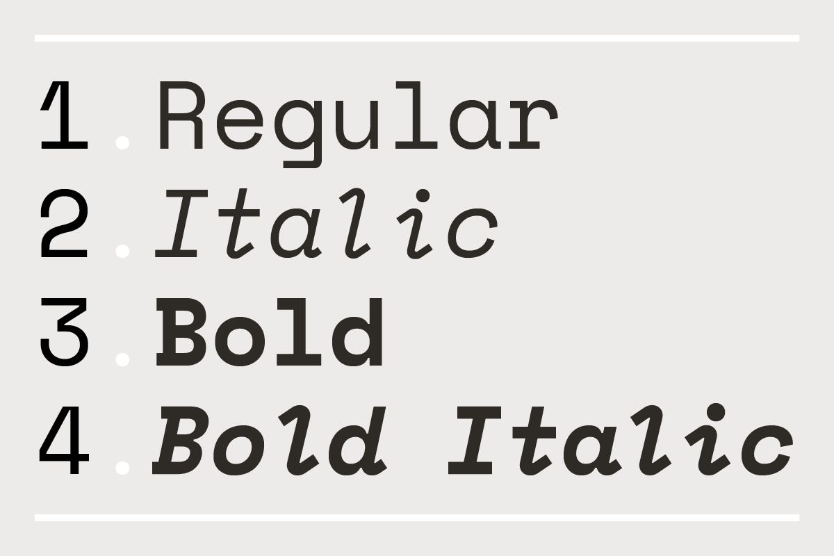
I even considered using Space Mono as my typeface for Headings and PT as my body copy - this was because Space Mono does feature more funny irregular features (for example the flat descenders) which would be more noticeable and striking as a heading, but in the end it was decided that the form would be more consistent and legible with it all in Space Mono - as it did come in Bold and Regular to provide that contrast. PT Mono on the other did not and I also later found out it was .tte file, .ttf so it wouldn't have worked online anyway!
Atleast with Space Mono it is a registered Google font - so it is fine for me to feature it on my website.
 What I love about this typeface, and after reading this case study on it by Colorphon (https://www.colophon-foundry.org/custom/spacemono/) is its little added characteristics which make it special like any good human - legible and clear but unique and a bit awkward!
Also the fact it comes in various weights for use across all media.
But also I found with its inspirations coming from futuristic sci fi interface typefaces, its described as having a particular 'retro-future' voice which I do think perfectly bridges a gap between the type and myself. I consider my whole style being very influenced by the past and the grunginess of vintage, analogue processes (in terms of fashion too) yet at the same time driving us into a future of possibility through digital means of creation and on the ever-evolving digital platform which is so influential nowadays.
With this new introduction of a Mono typeface, I thought it would be appropriate to trial out the logo in the same.
Although it is safe to assume the irregularity of the stroke widths and form make it look completely out-of-proportion for a logo. I think these initials do look best when they a considered and clear.
After taking my identity to a crit group it was suggested to me by nearly everyone how it is a striking and clever logo to represent my initials. However it did need stripping back that little bit more by getting rid of the 97..
People compared it to a clothes brand or old crest of some sort - not representative of a fresh new recent-grad motion designer! Age isn't an important factor anyway - it shouldn't determine the quality of my work or my working values so it is unnecessary for the client to know!
Testing out the new logotype alongside the development of the logo
- Clear to see the middle is most striking.
Before I had used a Beige - which is seen as dependable and flexible. Both being characteristics of a good designer.
The brighter oranges definitely inject some personality, but I just don't feel it represents me as a creative and my style.
I like to be different and have this grungy yet slightly worn aesthetic.
Which is why I have decided on a solid, hard-hitting black and white colour scheme to represent how my process and style is clean yet powerful.
Black is visually heavy, therefore is very strong - its most common association is power, authority and strength. Which is why too much of it can become overwhelming.
But when used with a white to compliment it, it can create this perfect balance - sitting any content at the forefront - bold and clear to see.
Using the visual balance of black and white with an accent colour leads to powerful messaging and is a helpful strategy when wanting to draw attention to a specific object or creating that visual “pop.” These black and white sites do just that. By accenting certain parts of the page with a different colour, they direct the viewer exactly where they want them to go and exaggerates the personality within that colour.
So the simplicity and power of black with white will feature across my identity, but then with accents of my favourite terracotta / orange colour which i feel is very recognisable to me through my t-shirts and the use of it in the waving gif - which is featured across all of my branding and everyone immediately links back to me.
You will see this put into action, applied to my outputs like:
- emails
- invoice
- business cards
- motion intro
and obviously the website..
I was able to reference a few examples here but I realised not that many designers actually have a set brand identity for themselves as individuals, unless they are working freelance alot - but even still I can see how it is a common trend to just have one solid logotype which their whole portfolio of work or brand can be recognised by - something simple yet hard-hitting and reflective of you and your style. Thats what most do anyway.. for example..


But its even better if you can have a little symbol to go with it like some of the examples above. So I'm definitely keeping mine!
So I re-visited the development of my initial logo...
Looking at how I developed the symbol and its enclosing circle around it.
Love the inter-locked initials, but think everything else needs to be stripped.
You can see how it developed into the more stripped back version I was using in second year here.
But I think its time I get rid of the 19-97 aswell.
I have always used beige colours in my bradning but I think it is clear that it is time to slightly develop this.
I considered a wide range of typeface options on-top of what I already had. Firstly I played with the more obvious sans serif typefaces which would work in terms of legibility and form as a logotype - but for me this seems abit too boring.
I looked at other styles of typefaces, mainly keeping it centred around the legible form of a sans-serif typeface, at a push a slab serif which still adopts the letterforms of a clear sans-serif.
But it was clear to me how I have always been attracted to the obscurity of mono typefaces. I think the weird, irregular nature of them shows signs of charisma and unpredictability and I love the various modifications, glyphs and weird sections of the letterforms that can give this whole new feel to the typeface.
I played with various options with Space Mono and PT Mono (very top right) ranking as my favourites and the easiest to get the rights to use online - as this is something I must consider now I am officially part of the industry, my designs must comply with ownerships and copyright regulations.
This was the problem with Ax0000 which is a free typeface I got off Use & Modify - as it isn't a registered typeface it would be difficult to use this online on my website and still comply. It is a bit too bizarre and peculiar to represent my whole practise and definitely not sturdy enough with no varying widths or weights.
I even considered using Space Mono as my typeface for Headings and PT as my body copy - this was because Space Mono does feature more funny irregular features (for example the flat descenders) which would be more noticeable and striking as a heading, but in the end it was decided that the form would be more consistent and legible with it all in Space Mono - as it did come in Bold and Regular to provide that contrast. PT Mono on the other did not and I also later found out it was .tte file, .ttf so it wouldn't have worked online anyway!
Atleast with Space Mono it is a registered Google font - so it is fine for me to feature it on my website.
 What I love about this typeface, and after reading this case study on it by Colorphon (https://www.colophon-foundry.org/custom/spacemono/) is its little added characteristics which make it special like any good human - legible and clear but unique and a bit awkward!
Also the fact it comes in various weights for use across all media.
But also I found with its inspirations coming from futuristic sci fi interface typefaces, its described as having a particular 'retro-future' voice which I do think perfectly bridges a gap between the type and myself. I consider my whole style being very influenced by the past and the grunginess of vintage, analogue processes (in terms of fashion too) yet at the same time driving us into a future of possibility through digital means of creation and on the ever-evolving digital platform which is so influential nowadays.
Although it is safe to assume the irregularity of the stroke widths and form make it look completely out-of-proportion for a logo. I think these initials do look best when they a considered and clear.
After taking my identity to a crit group it was suggested to me by nearly everyone how it is a striking and clever logo to represent my initials. However it did need stripping back that little bit more by getting rid of the 97..
People compared it to a clothes brand or old crest of some sort - not representative of a fresh new recent-grad motion designer! Age isn't an important factor anyway - it shouldn't determine the quality of my work or my working values so it is unnecessary for the client to know!
Testing out the new logotype alongside the development of the logo
- Clear to see the middle is most striking.
Now I needed to develop my colour justification.
However a discussion with a course-mate did suggest to me how the colour beige is neutral, calm, and relaxing - which i am not - but it can also be seen as quite boring. This is why if I am going to sample this more orange-y / terracotta colour from my favourite t-shirt which I'm known for wearing it needs to be used as little highlights alongside something else. Not the main focal point.
I decided to try and inject some more vibrant colours and personality into my identity with my favourite colour orange.
- Orange, the blend of red and yellow, is a mixture of the energy associated with red and the happiness associated with yellow. It is associated with meanings of joy, warmth, heat, sunshine, enthusiasm, creativity, success, encouragement, change, determination, health, stimulation, happiness, fun, enjoyment, balance, sexuality, freedom, expression, and fascination.
Orange is the colour of joy and creativity. It promotes a sense of general wellness and emotional energy that should be shared, such as compassion, passion, and warmth.
The meaning of the color orange is stimulating, vibrant, and flamboyant. While made up of red and yellow, it carries less aggression and fierceness than the colour red due to its combination with the calming colour yellow.
The brighter oranges definitely inject some personality, but I just don't feel it represents me as a creative and my style.
I like to be different and have this grungy yet slightly worn aesthetic.
Which is why I have decided on a solid, hard-hitting black and white colour scheme to represent how my process and style is clean yet powerful.
Black is visually heavy, therefore is very strong - its most common association is power, authority and strength. Which is why too much of it can become overwhelming.
But when used with a white to compliment it, it can create this perfect balance - sitting any content at the forefront - bold and clear to see.
Using the visual balance of black and white with an accent colour leads to powerful messaging and is a helpful strategy when wanting to draw attention to a specific object or creating that visual “pop.” These black and white sites do just that. By accenting certain parts of the page with a different colour, they direct the viewer exactly where they want them to go and exaggerates the personality within that colour.
So the simplicity and power of black with white will feature across my identity, but then with accents of my favourite terracotta / orange colour which i feel is very recognisable to me through my t-shirts and the use of it in the waving gif - which is featured across all of my branding and everyone immediately links back to me.
- emails
- invoice
- business cards
- motion intro
and obviously the website..


No comments:
Post a Comment