
I got approached by another creative, but time to create the personal identity for a textile artist / photographer / stylist
She wanted a logotype and symbol to represent her whole platform of work, so we got straight down to potential ideas.
We went through a few possible typefaces which we felt best represented her as a creative.

2. Goeslim
3. PT Mono
4. Elevant
5. Lack
We concluded how all the typefaces were relevant but represented different things
#3 was too awkward and obscure
#4 too art deco and traditional
#5 was too bland, she is multi-disciplinary and wanted to reflect herself with more of a current, memorable typeface - she referenced her friend / singer-songwriter Låpsley and suggested how although the accent doesn't mean anything, it makes an impact and has that memorable look to it which stays in your head.
#2 was a bit too girly and frilly (her words not mine!), although it came in various weights and styles
#1 provided her with that extra bit of stimuli she was after, that something different. as well as being very legible with more developed and attention-grabbing forms on certain letters - such as the descenders and ascenders being cut in half horizontally (not vertically) - is perfectly readable but feels very different and ab-normal so creates that lasting memory.
So Santana clearly had the strongest justification and felt most appropriate to her and what she wanted to represent.
- we decided we would modify it slightly to really sharpen the justification behind the dot in the centre of the 'o'.

Not only would this be reflective of her more geometric approach to her patterns, but it can be seen as a representation of her photography too, especially when looking at the dot inside the 'o' which can mimic the lens of a camera.
Next step to finalise the lone logotype was to decide how she wanted it laid out with her title - for use on website, socials and other media.

- All caps beneath or not?
- Fully justified alignment or left?
I guided her a lot at this stage showing how it is more impactful to have this kind of information in caps but not fully justified across the entire word-mark. This means it is easily legible at the smaller scale, yet it doesn't detract from the rest of the logo. And obviously as a logotype, it should be as striking as possible in bold.
Was then a matter of choosing how she wanted her initials to come together to create the symbol for her logo.

The placement within the square can represent different things to the creatives / audience.
My favourite being bottom right, reflecting ideas of being grounded yet pro-active and eager.
FINALS:

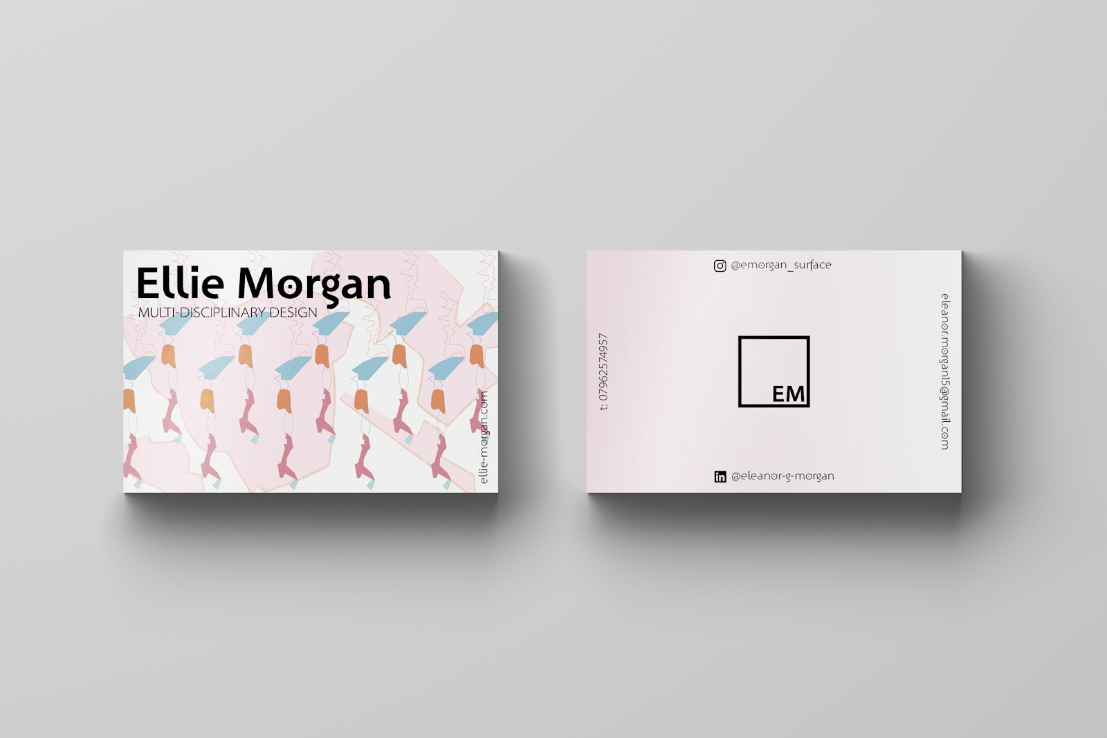
Now we needed to project this ident onto her business cards..
- we immediately hatched a concept for her business cards - deciding it would be interesting to have a few different versions of her business cards. This would be the same written content but mixing up the background patterns - a good way of showcasing the various pieces within her collection.
Did some initial layout research-


Started adapting various layout designs for the front and back of the business cards..


Wasn't keen on how the bottom bit has 2 social handles stacked up - taking away the layouts impact as it looks unconsidered - so instead I considered how I could combine the early designs to free up the space and make the front of the card more hard-hitting with the logotypes positioning ushering your eye around the content.

This meant there was a side for each bit of contact info - both of the social platforms on the top and bottom - and then telephone number and email on the sides.
Then it was time to consider how the patterns would actually look underneath the layout. It was clashing quite nastily, even when some of the type was inverted to white.
And plus I made the point - why do you need the pattern on both sides!?

With that realised, I removed some of the opacity from the patterns to create more of a contrast between the type and the pattern. This felt much better and was way more legible and easy on the eye.
On the reverse side I swapped the key colours from the patterns and created a soft gradient map - this would stay consistent with each pattern yet not distract away from the important contact information you need access to too..

I digitally mocked these up so the client could get more of a realistic view of how they will look once printed. I got nothing but compliments as the client could perfectly envision the final outcome and got quite excited to get the print slot sorted!


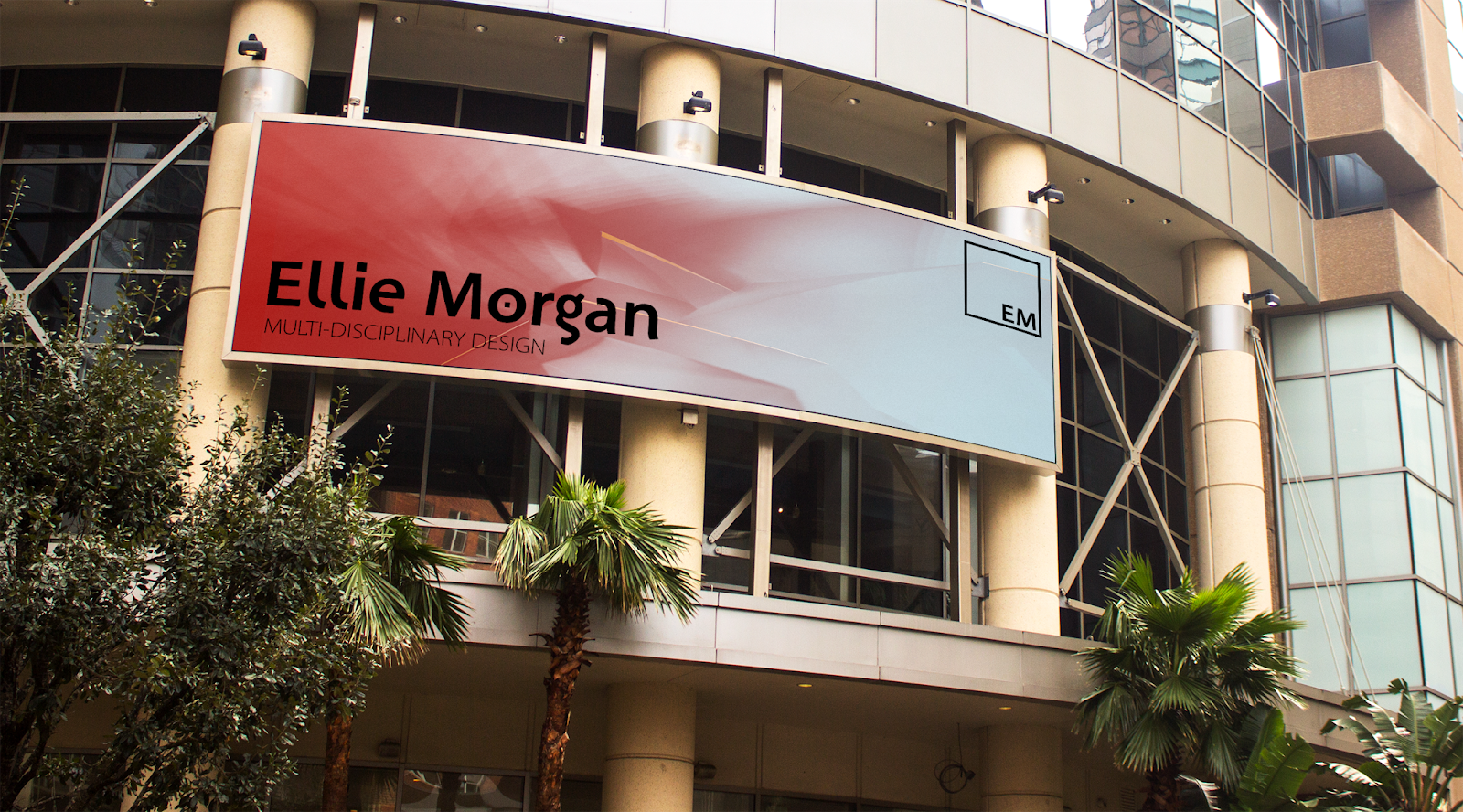
As well as throwing in a little billboard mockup to see how it could actually work in various environments and layouts in the real world.
Ellie was a very easy client to work with as she knew what she wanted yet was happy to let me experiment and create for her. She communicated herself well so I was able to create accurate representations of her ideas for her and even take them a step further in some circumstances; this resulted in an end result which she was really pleased with which looks and feels very professional - successfully giving her the confidence to go into industry with an identity she is proud of.
If it wasn't for my busy schedule I would have been more inclined to maybe offer to take this brief a step further and produce a variety of content across platforms for her - but in the short turn around we had, we were very happy with the final outcomes. She evaluated that I couldn't have been better, offering my professional advice and opinion on her ideas without being condescending - but allowing them to grow into stronger justifications for the both of us! I am glad I am getting feedback like this, showing me how I am building my client to designer approach skills all the time.
She was a dream client, clued up yet open to suggestions so we actually bounced off eachother very well to come to final decisions and agreements.
No comments:
Post a Comment